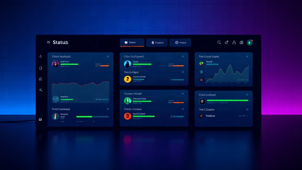
Best Status Page Examples from Top SaaS Companies in 2026
See what the best status pages from leading SaaS companies do right in 2026, and steal their design, communication, and monitoring tactics for your own.
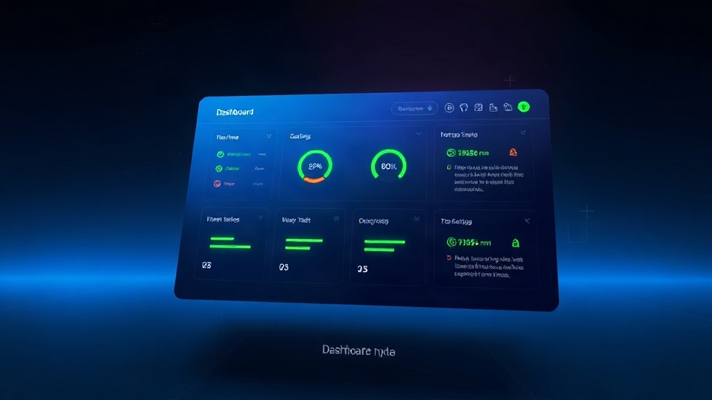
TL;DR: The best status pages in 2026 share five traits: real-time component-level monitoring, plain-language incident updates, historical uptime transparency, subscriber-first notifications, and branding that matches the main product. Below are real-world examples worth modeling, plus a checklist to audit your own page.
A status page is often the first (and only) place customers check during an outage. Yet most companies treat it as an afterthought — a generic "All Systems Operational" badge nobody trusts.
The companies that get it right turn their status page into a trust-building asset. Here's what separates a forgettable status page from one that actually reduces support tickets and keeps churn down during incidents.
What Makes a Status Page "Best-in-Class" in 2026
Before diving into examples, it helps to define the bar. The top-performing status pages this year consistently nail these fundamentals:
- Granular components — not just "API" but "API — US-East," "API — EU-West," "Webhooks," "Dashboard"
- Real historical data — 90-day uptime charts, not vague "99.9% uptime" claims with no backing
- Human incident updates — written like a person is talking to you, not legal-reviewed corporate speak
- Fast time-to-first-update — the first message posted within minutes of detection, not hours
- Subscriber options — email, SMS, Slack, RSS, and webhook subscriptions, not just email
Industry data backs this up: according to recent uptime benchmarking studies, companies that post an incident update within 5 minutes of detection see roughly 30-40% fewer support tickets during that incident compared to companies that wait 30+ minutes. Speed and clarity are the product now, not just the status itself.
Standout Status Page Patterns Worth Copying
Rather than naming and shaming specific vendors' current pages (which change constantly), it's more useful to break down the patterns the best-performing SaaS status pages use — patterns you can implement regardless of your stack.
1. The Component-Per-Region Breakdown
Global SaaS platforms split every major service by region instead of lumping everything into one status line. A payments API might show "Payments — US," "Payments — EU," and "Payments — APAC" as separate rows.
Why it works: a partial regional outage doesn't trigger a false "everything is down" alarm for customers in unaffected regions. It also builds credibility — vague, all-or-nothing statuses feel dishonest when only one region is actually affected.
2. The "Incident Timeline" Narrative
The best pages don't just post a status change — they tell a short story: detection time, impact scope, current mitigation, and next update time. Example structure:
- Investigating — "We're seeing elevated error rates on our checkout API starting at 14:02 UTC. Investigating now."
- Identified — "Root cause is a database connection pool exhaustion. Applying a fix."
- Monitoring — "Fix deployed at 14:19 UTC. Error rates back to baseline. Monitoring for stability."
- Resolved — "Confirmed stable for 30 minutes. Incident resolved. Postmortem coming within 48 hours."
This timeline format consistently outperforms one-line updates in customer trust surveys, because it shows competence, not panic.
3. Public Postmortems as a Trust Asset
Companies with the strongest reputations for reliability publish detailed postmortems linked directly from the resolved incident. They include a root cause summary, customer impact in plain numbers ("12% of API requests failed for 22 minutes"), and concrete prevention steps.
This isn't just goodwill — it's marketing. Prospective customers evaluating vendors during procurement frequently check the status page and postmortem history before signing a contract.
4. Branded, Embedded, and On-Domain
Generic third-party status page URLs (like a random subdomain that looks nothing like the main product) erode trust fast. The best pages live on a custom subdomain (status.yourcompany.com), match brand colors and fonts, and often embed a live uptime badge directly into the app's footer or admin dashboard.
If you haven't set this up yet, custom domains with free SSL are table stakes now — most modern status page tools, including Livstat, support this out of the box in minutes.
5. Multi-Channel Subscriber Options
Email-only subscriptions are outdated. Leading SaaS status pages let users subscribe via SMS for critical infrastructure alerts, Slack/Teams webhook integration for engineering teams, and RSS for automated internal dashboards.
The logic: different stakeholders need different urgency levels. A CTO wants an SMS for a full outage; a developer wants a Slack ping for a degraded API; a curious end user wants email.
6. Uptime Transparency, Not Just a Badge
Rather than a single "99.98% uptime" number with no context, top pages show:
- 90-day rolling uptime percentage per component
- SLA compliance indicators where relevant
- A visual history bar (green/yellow/red blocks per day)
This level of transparency is increasingly expected by enterprise buyers doing vendor due diligence, especially in fintech, healthcare, and infrastructure sectors where SLA penalties are contractual.
A Quick Self-Audit Checklist
Use this checklist to see how your current status page stacks up against 2026's best practices:
- Components are split by service and region, not lumped together
- First incident update goes out in under 5 minutes of detection
- Updates read like a human wrote them, with timestamps and specifics
- Historical uptime (90+ days) is visible without clicking into each component
- Postmortems are published and linked from resolved incidents
- Page lives on your own custom domain with your branding
- Subscribers can choose email, SMS, Slack, Teams, or webhook
- Maintenance windows are scheduled and posted in advance, not sprung on users
If you're missing three or more of these, your status page is likely underperforming — and probably generating more support tickets than it needs to.
How to Get There Without Rebuilding From Scratch
You don't need an engineering sprint to match the examples above. Most of these improvements are configuration changes, not custom development:
- Break your monitors into region-specific components this week
- Draft 3-4 incident update templates for common scenarios (degraded performance, full outage, scheduled maintenance)
- Turn on SMS and Slack/Teams notification channels for subscribers
- Set up a custom domain and match your brand's color palette
- Commit to publishing a postmortem for every P1/P2 incident going forward
Tools like Livstat bundle monitoring and status page publishing together, so component-level checks, regional breakdowns, and multi-channel notifications are configured from one dashboard instead of stitching together separate tools.
Key Takeaway
The best SaaS status pages in 2026 aren't winning because of flashy design — they're winning because they're fast, specific, and honest. Granular components, quick human updates, transparent uptime history, and real postmortems turn a page that customers dread checking into one that actually builds loyalty during your worst moments.
Audit your page against the checklist above this week. The gap between a mediocre status page and a great one is smaller than most teams think — and it shows up directly in support ticket volume and customer trust.